Starting Out
I knew my website was due for a redesign. The old version of the site was using a design held over from the days when I wanted to be a computer science major, and the look reflects that. It was never really built to showcase media, and it looked really bad on mobile devices as it was built for desktop first.
Drawing Inspiration
I’ve always been a fan of minimal, geometric designs.
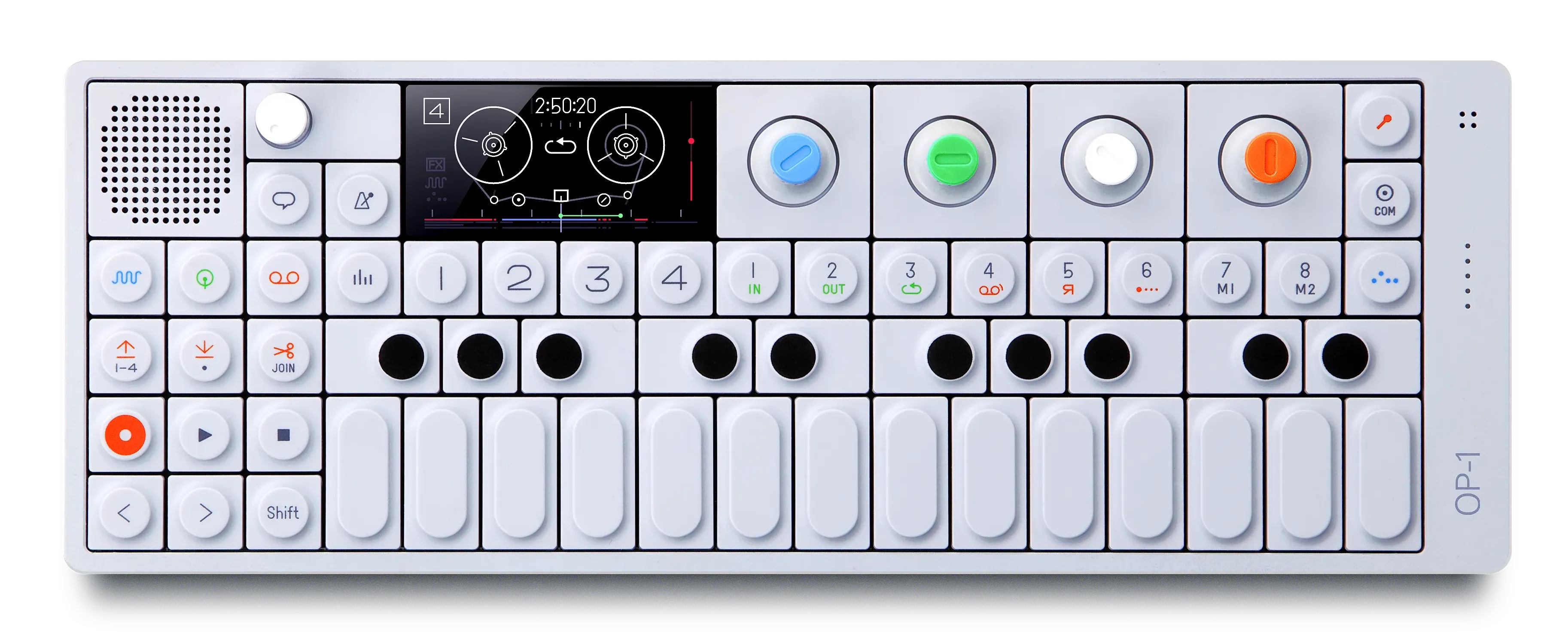
Teenage Engineering’s designs have always been some of my favorites. Their designs always look and feel playful and elegant while still being functional.
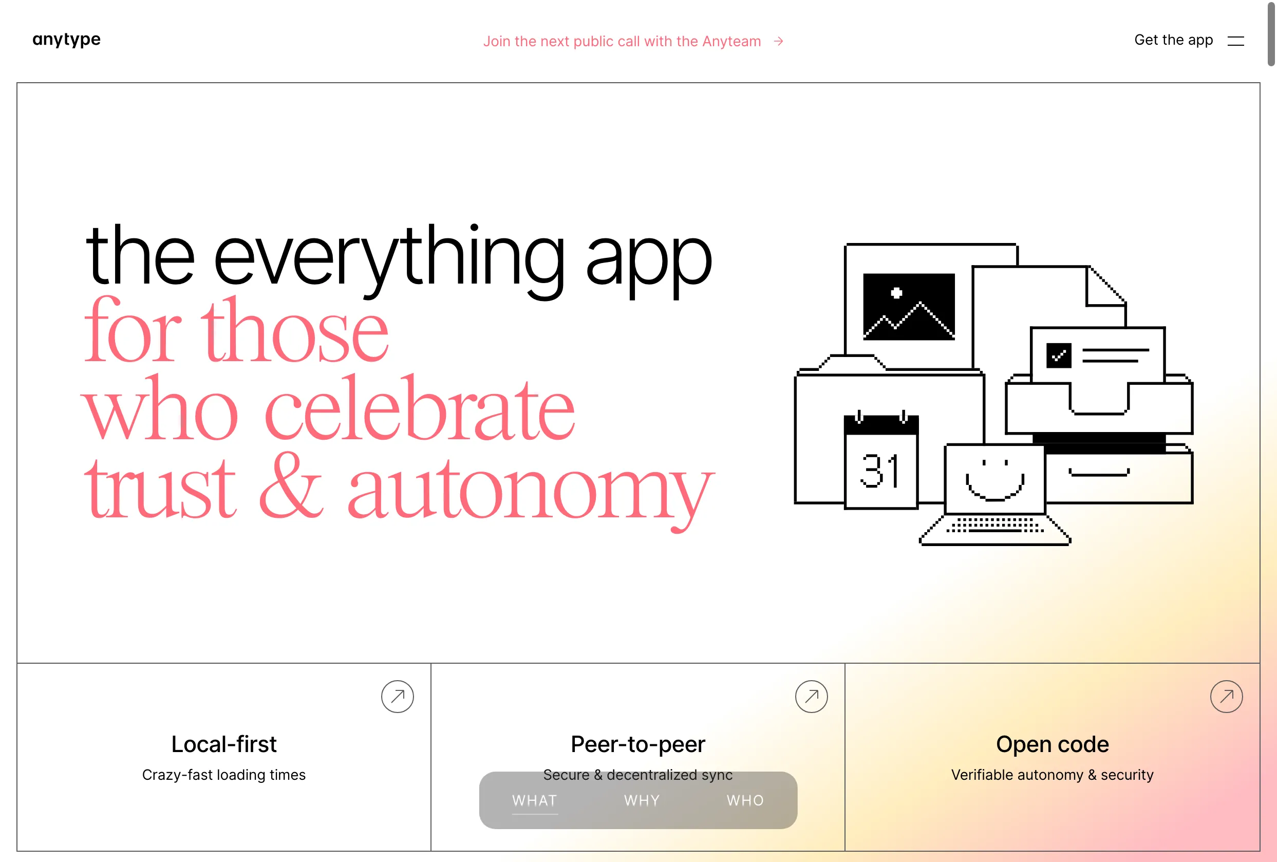
I love the aesthetic of the Anytype website.1 The clean, thin grids, the Macintosh System 1 inspired icons and graphics, and the little splashes of color all blend together well.
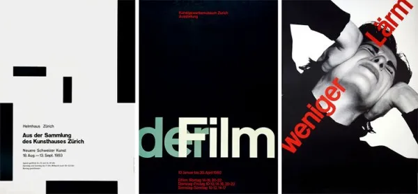
As it turns out, this style of design has a name: Swiss Style.
Swiss Style
“Swiss Style” is a graphic design trend that centers (broadly) around grids, sans-serif fonts, and asymmetrical designs.2
Josef Müller-Brockmann was an influential Swiss style designer, helping spread Swiss style beyond Europe.3
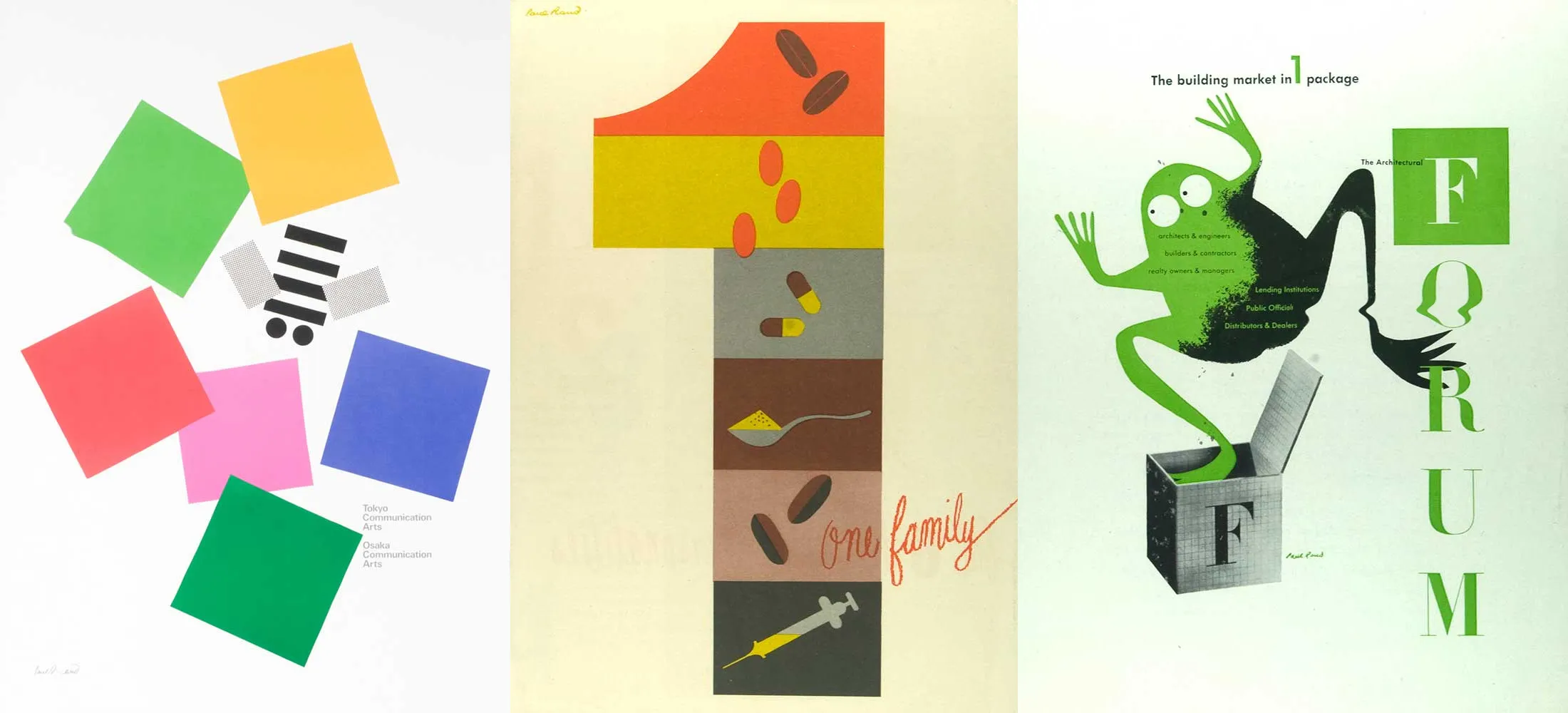
You might be familiar with American designer Paul Rand, known for his work on iconic logos like ABC and IBM. He was one of the first American designers to embrace Swiss style in his work.45
Designing
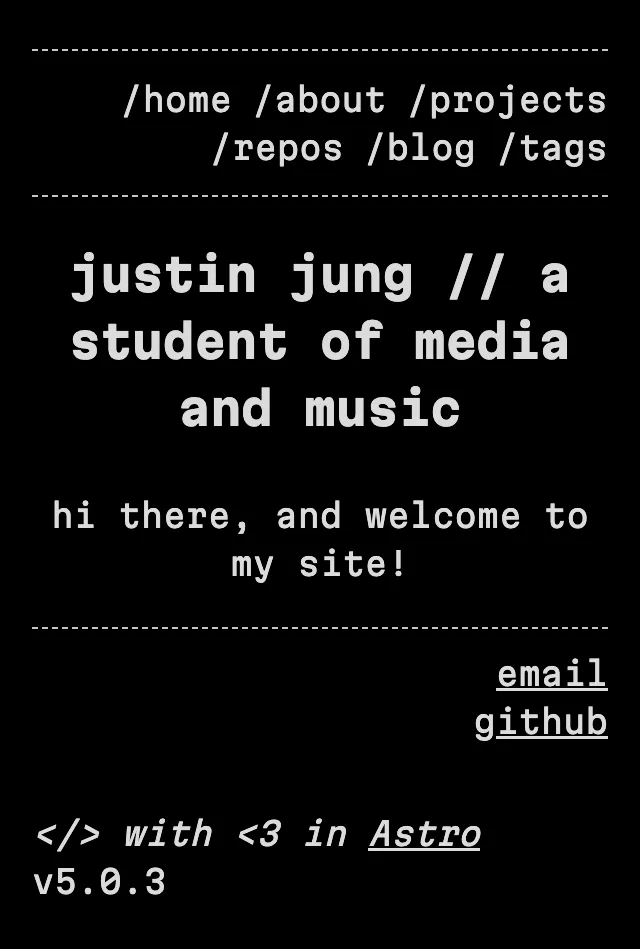
One of my main design goals with this new site was to design for mobile first, then expand to tablet and desktop. This paradigm has been termed “mobile-first design,” and it has lots of benefits on both the design and development side.
On the design side, it allows you to start with simpler designs that work well on mobile and increase complexity as the screen size stretches. In this way, even if the mobile version is potentially missing design elements or features of the desktop layout, the design looks intentional.
On the development side, it’s much easier to take a layout and stretch it than it is to take a layout and shrink it. Developing mobile-first allows you to, again, add complexity as the codebase expands.
I also made extensive use of Figma’s auto layout to simulate CSS flexboxes, and designing this way helped me avoid some design decisions that would have been…painful to actually implement.
Nevertheless, work was steady, and I’m pleased with the result.

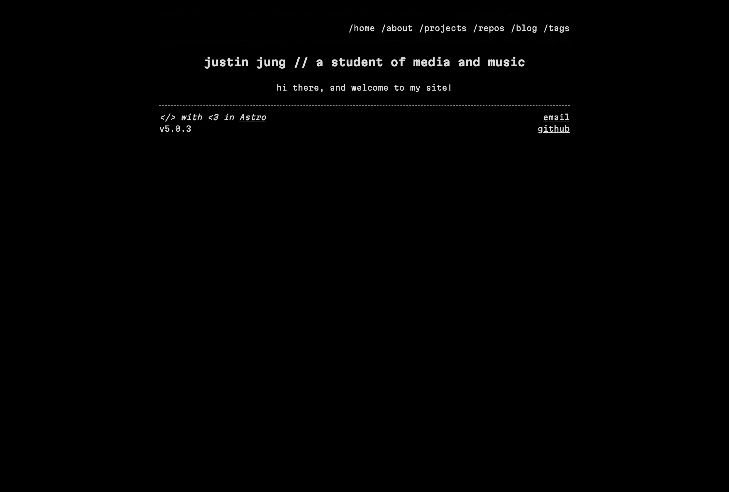
All in all, the total design process took about 20 days. You should be able to see the influences of swiss style design in the final result (hopefully).
Development
Developing the website took about a month. I worked in Astro, a JavaScript framework and static site generator (SSG). I could have used another SSG like 11ty or Hugo, but Astro is popular and I heard good things about the developer experience.
How Astro Works
If you already know how Astro functions, skip this section by clicking here.
For those who don’t understand how Astro works, sites are built using components: reusable UI elements that are encapsulated in a single file. You might have a group of buttons for example:
<div>
    <button>Button 1</button>
    <button>Button 2</button>
    <button>Button 3</button>
    <button>Button 4</button>
</div>
This is fine, but what if you want to reuse this button group somewhere else? Instead of copying and pasting the code (and having to update every instance if you change something), you could create a component and reuse the component throughout your UI.
---
// ButtonGroup.astro
---
<div>
    <button>Button 1</button>
    <button>Button 2</button>
    <button>Button 3</button>
    <button>Button 4</button>
</div>
---
// index.astro
import ButtonGroup from '@components/ButtonGroup.astro';
---
<ButtonGroup />
<ButtonGroup />This way, any changes to ButtonGroup.astro immediately propagate to every instance of the component on the site.
This also allows you to scope styles at the component level, so any styles applied to ButtonGroup.astro don’t apply to index.astro.
---
// ButtonGroup.astro
---
...

<style>
    * {
        text-color: red;
    }
</style>
---
// index.astro
---
...
<ButtonGroup />
<p>This text will not be red.</p>On This Site
I used Astro components heavily on this site, for reusable UI components and for layouts.
Commonly reused code snippets like date strings (and their formatting), images, and the navbar are components that are reused across pages.
---
// Date.astro
interface Props {
    date: Date,
    formatString?: string,
    appendString?: string
}

import { format } from 'date-fns';
import { tz } from '@date-fns/tz';

const { date, formatString = "yyyy/MM/dd", appendString } = Astro.props;
const formattedDate = format(date, formatString, { in: tz("UTC")});
---
<p class="date">{formattedDate}{appendString && ` ${appendString}`}</p>

<style lang="scss">
    .date {
        margin-block: 0;
        margin-top: calc(var(--global-padding) / 8);
        color: var(--secondary-color);
        font-style: italic;
    }
</style>
Every page is based on the ContentPage layout which is based on the Page layout (except the home page, which is based on Page). The ContentPage layout provides the basic layout, including semantic HTML elements, a navbar, proper <head> content, and so on.
---
import ContentPage from "@layouts/ContentPage.astro";
---

<ContentPage>
    <!-- Page content here -->
</ContentPage>

<script>
    // Any page-specific scripts
</script>

<style>
    /* Any page-specific styles */
</style>
Developing Across Screens
You’ll notice that there are very few absolute sizing units present. For the most part, sizes are set using rem or by calculating against the global-padding CSS variable (which is itself set using rem). This means that when creating styles, it’s easy to adjust the “scale” of the site by setting font-size on html (thereby changing the values for rem).
Wrapping Up
After doing some final quality control checks, testing on multiple devices, and giving everything a once-over for spelling and grammar, the site was ready to deploy. Fortunately, I had been using Vercel to deploy my website, so it was as simple as creating a pull request to main and merging in the work I’d done.
I’m really pleased with the result, and the design is also simple enough at its core that I’ve been able to apply the same visual elements and cues to other things like my resume and business
card. ■
Footnotes
-
Anytype is a pretty great free and open-source Notion alternative with a focus on privacy and decentralized sync. It’s got a super deep typing and relations system that’s a bit hard to wrap your head around the first time, but it’s a really incredible piece of software. ↩
-
For more, check out the Wikipedia article. ↩
-
https://www.printmag.com/featured/swiss-style-principles-typefaces-designers/ ↩